
.jpg)

Carmakers such as Volkswagen, Audi, Citroen, Nissan, Peugeot, MINI, Toyota, Dacia, Renault, Volvo, Kia, Rolls-Royce, Ford, MG, and Vauxhall have all opted to flatten their logos in a departure from the chrome-style and metallic badges that prevailed in the early 2000s.
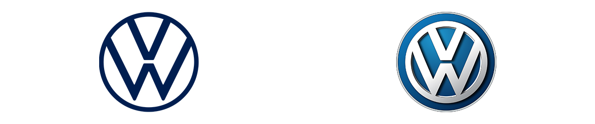
Logos across the board are beginning to lose their textures and three-dimensional features – a style which is known as skeuomorphism.
But why is this change suddenly happening? The answer is all to do with the new digital era.

As more car companies come to rely on apps and websites to sell and advertise their products, the need for a logo design that can easily translate across several mediums is becoming more necessary. A logo now has to work on a digital screen before anything else, so any complicated details and 3D perspectives are being phased out across the industry.
A simple flat image, consisting of just key shapes and lines, can be reduced down to a small icon in the corner of your screen and still be recognisable whereas a more complex image loses its distinguishable features.
Ultimately, the main reason for much of the change has been down to functionality and practicality, however, aesthetics and trends have played a part too.
Chunky metallic badges no longer convey the innovation and forward-thinking that a sleeker 2D badge can embody. The rise of new modern electric vehicles filled with the latest technologies and features is better represented with a cleanly designed logo.
Volkswagen demonstrated this when it released its new logo with its new ID.3 electric model.
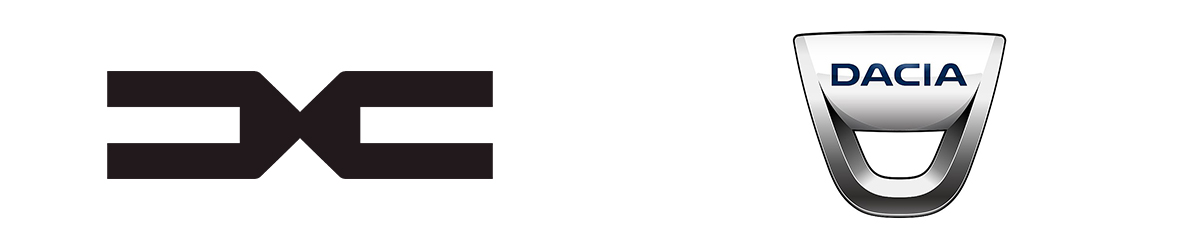
Some manufacturers have taken more radical approaches when changing their crests. Dacia for example scrapped their old design, which featured a shield with the name Dacia on it, for a simpler design that consists only of their D.C. initials.
Dacia is a relatively new brand though and other carmakers don’t necessarily have the luxury of being able to sideline a recognisable design that has served them well for decades. This means that even though you can expect to see more changes in the future, it’s likely that a lot of the iconic design features of older brands will continue to stick around for a bit longer, even if it is in a two-dimensional design.
The shift away from skeuomorphism isn’t just occurring in the car industry, it's happening pretty much everywhere there's a logo. From the apps on your phone to the badges of your favourite football club – minimalism is taking over, whether you like it or not!


.png)