
.jpg)

Whether it’s a three-pointed star, four interlocking rings, or a prancing horse, some car logos are so iconic that they can be recognised from description alone.
But what does the badge on your car really mean? From references to mythology and aviation to family crests and electric motors, car logos often reveal far more about a brand’s history than you might expect.
In this article, we take a look at the hidden meanings and surprising origins behind some of the world’s most famous car logos.
Tesla
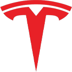
Many people assume the Tesla logo is simply a stylised ‘T’, but there’s actually much more to it.
Elon Musk revealed that the design represents a cross-section of an electric motor, with the curved top section symbolising part of the rotor and the vertical line representing a section of the stator.
The design is particularly fitting, given that the company is named after the renowned electrical engineer Nikola Tesla, whose work helped shape modern electrical systems.
Ferrari
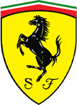
Ferrari’s famous prancing horse is one of the most recognisable automotive symbols in the world, but did you know the design predates the car company itself?
The black horse originally appeared on the fighter plane of Italian World War I pilot Count Francesco Baracca, who became a national hero before being shot down in 1918.
When Enzo Ferrari met Baracca’s parents in 1923, they suggested he use the horse on his racing cars as a symbol of good luck. Ferrari later added the yellow background to represent his hometown of Modena, while the ‘SF’ initials stand for Scuderia Ferrari – with Scuderia meaning ‘stable’ in Italian.
BMW
Despite popular belief, BMW's badge was not originally designed to represent an aircraft propeller. While BMW did produce aircraft engines in its early years, the famous blue and white quadrants actually originate from the Bavarian flag.
Meanwhile, the dark outer ring was inherited from BMW’s predecessor company, Rapp Motorenwerke.
Mercedes-Benz

The three-pointed star used by Mercedes-Benz originated from a postcard sent by the company's founder, Gottlieb Daimler, to his wife in the 1870s. Daimler marked the location of his home with a star and reportedly wrote that one day it would shine over his factories.
When the logo officially appeared on vehicles in 1910, the three points came to represent land, sea and air, reflecting the company’s ambitions across multiple forms of transport.
Audi

Audi’s four interlocking rings symbolise the merger of four manufacturers: Audi, DKW, Horch and Wanderer. These companies joined together in 1932 to form Auto Union, with each ring representing one of the founding brands.
The silver colouring also has historical significance, as silver was Germany’s national racing colour during the early motorsport era.
Porsche
Porsche’s crest is deeply connected to Stuttgart, the German city where the company was founded.
The horse in the centre references the fact that the Porsche headquarters was originally built on a horse-breeding farm, while the surrounding shield is inspired by the Württemberg coat of arms.
Alfa Romeo
Alfa Romeo’s badge is packed with symbolism linked to the city of Milan.
On the left side is a red cross taken from the flag of Milan, while the right side features the Biscione – a serpent eating a man – which was associated with the influential Visconti family during the 11th century.
Lamborghini
Lamborghini’s raging bull perfectly reflects the brand’s aggressive and dramatic supercars, but the logo also has personal significance. Founder Ferruccio Lamborghini was born under the Taurus zodiac sign and had a strong interest in bullfighting.
Many Lamborghini models, including the Miura, Aventador and Murciélago, have also been named after famous fighting bulls.
Bentley
Bentley’s winged badge dates back to the company’s involvement in aircraft engine production during the First World War. The wings symbolise speed, freedom and aviation heritage.
Interestingly, the number of feathers on each wing is uneven, adding an unusual hidden detail to the design.
Maserati
Maserati’s trident logo was inspired by the statue of Neptune located in Bologna, the city where the Maserati brothers founded the company.
The trident was chosen to symbolise power and strength, matching the character of Maserati’s performance-focused cars.
Citroën

Citroën’s double chevron logo comes from a gear design discovered by founder André Citroën during a trip to Poland in 1901. He purchased the patent for a double-helical gear system, and the shape of the interlocking teeth inspired the famous emblem that’s still used today.
Although the logo has evolved over time, the distinctive chevrons have remained central to Citroën’s identity for more than a century.
Subaru
Subaru’s logo represents the Pleiades star cluster, which is visible in the night sky. In Japanese, ‘Subaru’ roughly translates to ‘unite’ or ‘come together’, reflecting the merger of several companies to form Fuji Heavy Industries.
The larger star symbolises the parent company, while the smaller stars represent the businesses that joined together.
Volvo

Volvo’s circular badge with a diagonal arrow is sometimes mistaken for a male gender symbol, but it actually originates from the ancient symbol for Mars and iron.
Sweden has a long history in the iron industry, and Volvo chose the emblem to represent durability, strength and safety. These qualities would later become central to the company’s reputation worldwide.
Hyundai

At first glance, Hyundai’s logo appears to be a simple italicised ‘H’. However, the badge is actually designed to represent two people shaking hands – one representing the company and the other the customer.
The logo symbolises trust, satisfaction and the relationship between the brand and its drivers.
Toyota
The world's largest car manufacturer is easily recognisable thanks to its simple yet distinctive logo.
Most people will have noticed that the two overlapping ovals create a stylised letter ‘T’, but the design actually has several meanings. Toyota says the two inner ovals represent the relationship between the customer and the company, while the outer oval symbolises the world embracing Toyota's products.
Some enthusiasts have also pointed out that the various intersecting lines can be used to spell every letter of the word ‘Toyota’, though the company has never confirmed whether this was intentional.
Peugeot
Peugeot’s lion logo has evolved significantly over the years, but the symbol itself dates back to the 1800s, before the company even started building cars.
Originally, the lion represented the strength, flexibility and sharpness of Peugeot’s saw blades and tools. Today, it remains one of the oldest automotive emblems still in use.
Mitsubishi

Mitsubishi’s logo directly reflects the company’s name. ‘Mitsu’ means three, while ‘Hishi’ refers to a diamond or rhombus shape.
Combined, they form the iconic three-diamond emblem that has remained largely unchanged for generations.
Skoda

Skoda’s logo is one of the more unusual designs. The badge features a winged arrow with three feathers, although the exact origin of the symbol is still debated today.
The arrow is believed to represent speed and progress, while the wings symbolise freedom and advancement. Meanwhile, the eye at the centre of the design reflects precision and vision.
The green colour that Skoda is now closely associated with was only introduced during the early 1990s following the brand’s modernisation under Volkswagen Group ownership.
Smart

Smart’s logo cleverly combines two details into one simple design. The large ‘C’ stands for ‘compact’, reflecting the brand’s focus on small city cars, while the arrow symbolises forward thinking and innovation.
Though Smart has produced much larger cars in recent years, the minimalist logo was well-suited to its original mission of creating practical urban vehicles designed for crowded city streets.
Vauxhall
The griffin featured on the Vauxhall logo actually dates back to the 13th century. The company’s name originates from ‘Fulk’s Hall’, a property owned by soldier Falkes de Breauté, whose family crest featured a griffin holding a flag.
Over time, the name evolved into ‘Vauxhall’, while the mythical griffin became the centrepiece of the company’s badge.
Mazda

Mazda’s current logo contains several hidden meanings within its simple design. The oval surrounding the badge represents the sun, while the stylised ‘M’ has been shaped to resemble outstretched wings.
According to Mazda, the wings symbolise creativity, flexibility and the company’s desire to ‘soar’ towards the future. This is in keeping with the company’s name, which is named after Ahura Mazda, the ancient Persian god of wisdom, intelligence and harmony.
MG

MG’s famous octagonal logo was originally designed to help distinguish the brand’s sporty models from standard Morris vehicles.
The unique eight-sided shape became closely associated with British sports cars and was even carried through into vehicle design, with some classic MG models featuring octagonal instrument dials and styling details inspired by the badge itself.
Abarth
The scorpion featured on the Abarth logo comes from the astrological sign of the company’s founder, Carlo Abarth.
At the top of the badge, you’ll also notice the colours of the Italian flag, while the red and yellow shield reflects Italy’s historic racing colours.
The aggressive scorpion design perfectly matches Abarth’s reputation for producing small but aggressive high-performance cars.
Looking for a new car?
Whether you’re interested in an electric car from Tesla, a practical family SUV from Hyundai or a performance-focused model from BMW, choosing the right car is about more than just the badge on the bonnet.
At Jurni, we offer a wide range of car leasing deals across some of the world’s biggest automotive brands. Browse our latest offers or get in touch with our team to find your next car.





.png)